|
Ring: The Legend of the Nibelungen (Second Opinion)
 [The
'Karen' referred to below was my co-editor at Games Domain review. She gave Ring a 5-star/gold medal
review. Believe me, there were a few heated e-mail exchanges over that, because I thought it was a complete
pile of rubbish. There's also the more down-to-earth Quandary
review of Ring to consider, though Gordon was a lot more charitable than I was - ed.] [The
'Karen' referred to below was my co-editor at Games Domain review. She gave Ring a 5-star/gold medal
review. Believe me, there were a few heated e-mail exchanges over that, because I thought it was a complete
pile of rubbish. There's also the more down-to-earth Quandary
review of Ring to consider, though Gordon was a lot more charitable than I was - ed.]
Karen pretty much covered the story, graphics, and music in her review. Actually, that's a gross
understatement. So, I won't go near any of that, except to say that in the graphics department, I felt
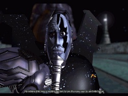
they cut corners somewhat by having the various characters' lips, and sometimes the whole face, move
in an artificial, rubbery fashion during speech. It made even supposedly serious passages seem comical,
and detracted from the otherwise fabulous presentation.
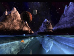
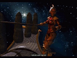
And let me assure you, these are simply the most inspired rendered graphics I have ever seen in a
computer game! Floating mountains, skies full of stars, just like a space opera should be. As a matter
of fact, they only forgot one thing. They forgot that there's supposed to be a game lurking in there
somewhere...
Yes, I'm afraid the designers at Arxel Tribe must have skipped a few Game Design 101 classes. For starters,
the game at first appears to be incredibly difficult, but only because you can't figure out what you're
meant to do. When you finally manage to wrap your head around the gameplay, then you realise that it's
actually too easy. I finished the game in 9 hours, and I'm not one to brag about this kind of thing. At
least 3 of those 9 hours were spent scratching my head because I simply could not comprehend the gameplay.
Here's a quote from the manual:
"One of the key innovations of RING is its non-linearity. The adventure is divided into four chapters
which you can play out simultaneously or in whatever order you desire.
(descriptions of each chapter)
The order in which these adventures are listed is recommended for players less familiar with adventure
games."
Silly Steve. Figuring that the last sentence there couldn't possibly apply to me, I launched right into
one of the chapters picked at random and... wound up smack in the middle of a 15-minute long dialogue that
made absolutely no sense at all because it was based on events that obviously happened in a previous chapter.
So, I went back to the drawing board and started with Chapter 1. And that's when the 'fun' really began...
 When
you can swing around a full 360 degrees so fast that it makes you dizzy, and tilt through 90 degrees at the
same time, you can imagine it would be easy to miss the odd hotspot. You see, the game is so beautifully
rendered, that objects blend in seamlessly with the background unless you happen to note the very subtle
change in cursor that denotes a hotspot when you sweep across it. Chalk up one hour of lost time here, because
I blew right by the very first hotspot in the entire game and couldn't get anywhere without the objects I was
supposed to have found there. When
you can swing around a full 360 degrees so fast that it makes you dizzy, and tilt through 90 degrees at the
same time, you can imagine it would be easy to miss the odd hotspot. You see, the game is so beautifully
rendered, that objects blend in seamlessly with the background unless you happen to note the very subtle
change in cursor that denotes a hotspot when you sweep across it. Chalk up one hour of lost time here, because
I blew right by the very first hotspot in the entire game and couldn't get anywhere without the objects I was
supposed to have found there.
Problem number 2 concerning the interface is that there is very seldom any feedback when you do something
incorrectly. You know how in most games, your character will voice a subtle hint when you try to use an object
in the wrong way (as to how it might be used), or at least say "Well, that won't work." Uh uh. All that happens
here is (imagine beautiful music playing incessantly in the background) the object you were trying to use winds
up back in your invisible inventory so fast that if you blinked then you missed the event. No audible feedback
that you did something wrong. So, you have to continually keep returning to the top of the screen and
right-clicking to bring up your inventory. Nope! That darn object is back in my inventory. Guess that didn't
work. Should I try it again? You see, the same thing happens if you fail to position the object exactly over a
hotspot before you click. So, is it the wrong object, or did I just not place it correctly?
Problem number 3 concerns finding your way around. Again, because the entire view is rendered uniformly,
it's not at all obvious where your character can travel. The cursor changes to a different shape to indicate that
you can move (vaguely) in a certain direction, but in one case two of these directional hotspots were only
separated by a few pixels! So, I wasted another hour there because I kept missing a path in the forest, assuming
there was only one hotspot there rather than two. Arrggghhhh! Also, I found myself incredibly disoriented for
large portions of the game. There are lots of obvious looking paths drawn in many of the scenes, so you keep
placing your cursor over them. But very seldom can you actually travel on these paths. They're just part of the
background illustration. And finally...
 Aside
from one puzzle, which is literally impossible to solve without a walkthrough (you have to guess a number between
0 and 999 having been presented with the most tenuous clue in gaming history), the rest are so easy that Ring
will have veteran adventurers yawning well before their bedtime. At most, you only ever have a half dozen objects
in your inventory. Since the interface doesn't allow you to combine objects, it's a simple matter of just trying
every object on every hotspot when you get stuck. Personally, I hate to resort to this tactic because it feels
like cheating. But you do get stuck, simply because a lot of the puzzles just don't make sense! Aside
from one puzzle, which is literally impossible to solve without a walkthrough (you have to guess a number between
0 and 999 having been presented with the most tenuous clue in gaming history), the rest are so easy that Ring
will have veteran adventurers yawning well before their bedtime. At most, you only ever have a half dozen objects
in your inventory. Since the interface doesn't allow you to combine objects, it's a simple matter of just trying
every object on every hotspot when you get stuck. Personally, I hate to resort to this tactic because it feels
like cheating. But you do get stuck, simply because a lot of the puzzles just don't make sense!
So in the end I was dazzled by the majestic graphics, but totally pissed off by the gameplay. Historically,
this has been the problem with every game ever produced by Cryo, and sad to say, Ring is just the latest in
a long line of could-have-beens.
Copyright © Steve Metzler 1998.
All rights reserved.
|

